
Recommended destinations
Help travellers discover new destinations to add to their Rome2Rio trip plan
13%
of travellers hovered over destination pins
12%
increase in multi-stop planning sessions
8%
of multi-stop sessions added a destination via map pins
How do you help travellers find their next destination?
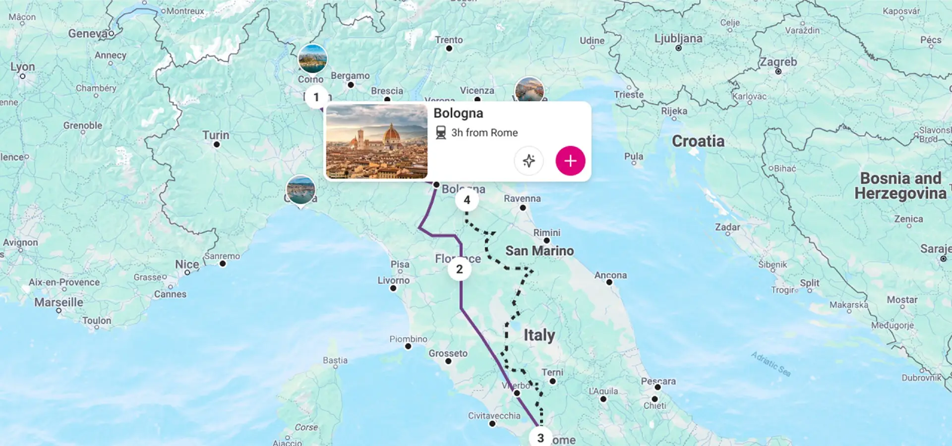
As part of the broader effort to increase engagement with Rome2Rio's trip planner, I led the design of a feature to help travellers discover new destinations for their trip. When travellers planned trips with three or more destinations, the product performed well. The challenge was helping more travellers add destinations.
Images drive destination decisions
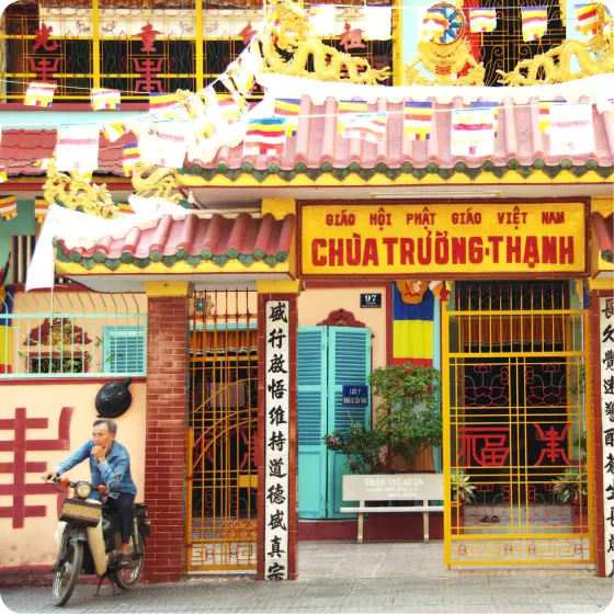
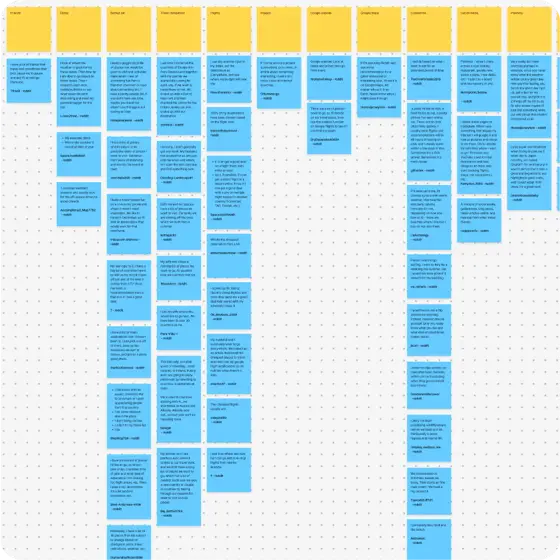
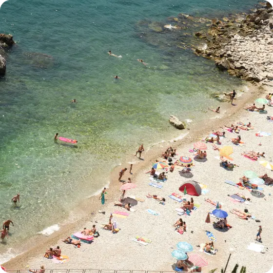
I conducted background research on travel advice forums and subreddits to understand how travellers choose destinations. Images played a significant part in the decision making process. People were not just choosing a place because of their interests and its location, they were choosing destinations because they looked visually appealing.
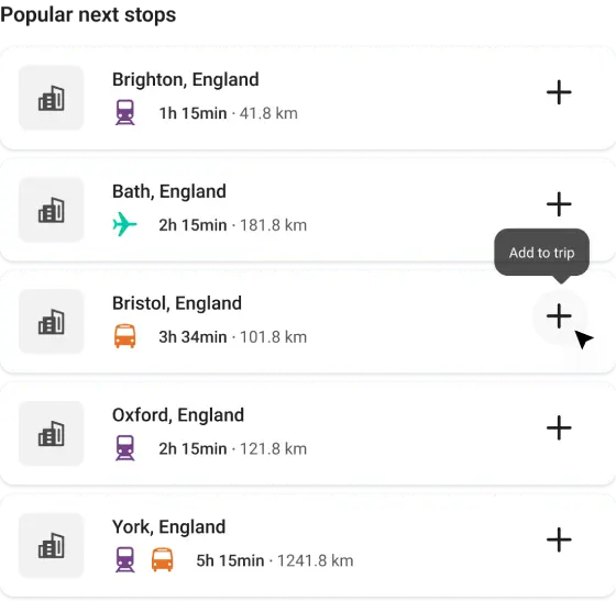
Trip details pane ideation
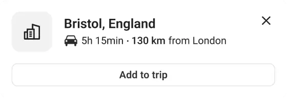
Lofi map card with transport info

Compressed map card
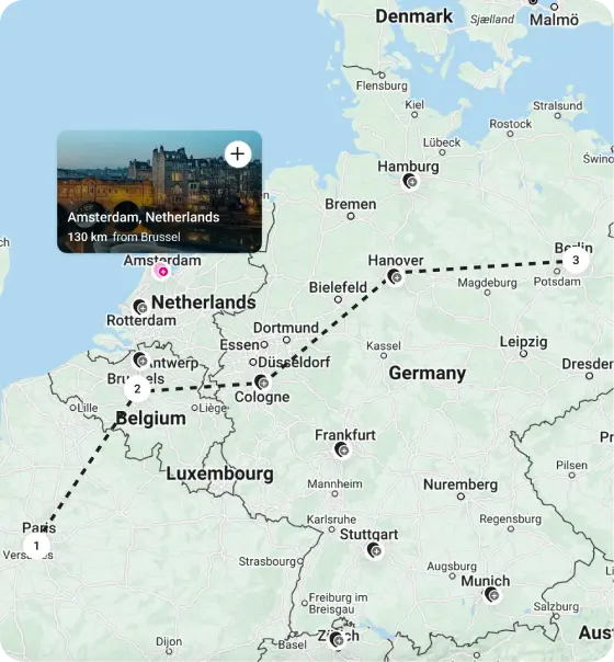
Google map exploration
Concepts utilised images alongside travel time data
Benchmarking map-based competitors informed early ideation. Concepts focused on map interaction that revealed destination details, with images and the travel time between a traveller's previous destination and the recommended next destination. The travel time was included to demonstrate the value of Rome2Rio's transport data when planning trips.
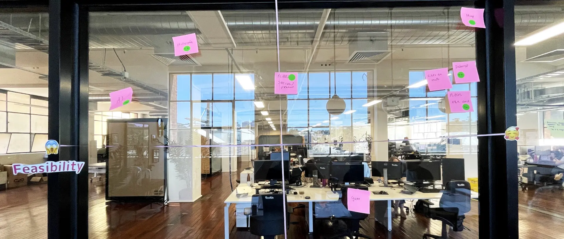
I aligned the team around a map-based approach
To further explore the problem space, I organised a cross-functional ideation workshop that examined how to help travellers add destinations to their trip plans. We explored how improving the trip plan, destination pages, and map interaction could engage travellers.
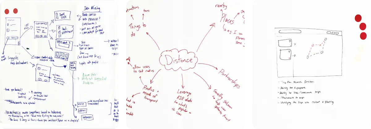
Workshop ideations
After synthesising ideas from the workshop, I presented the recommended approach to the Product Manager. Map-based visualisation emerged as the strongest opportunity, with hover cards surfacing destination images and transport information.
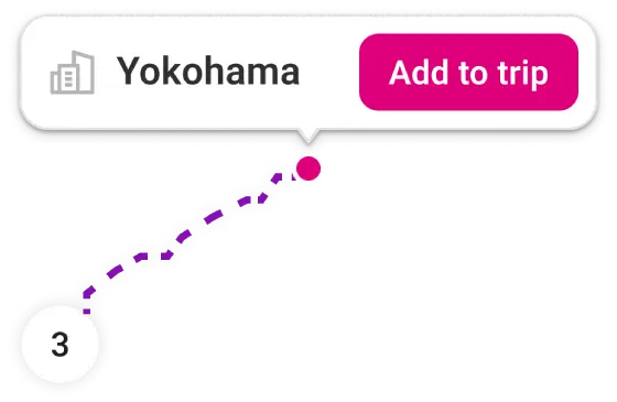
MVP approach
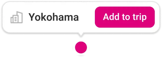
An early MVP A/B experiment proved promising
To determine whether travellers would utilise map recommendations, we released a Minimum Viable Product (MVP) as part of an A/B experiment. The design was simplified to focus solely on place names, to match our development capacity. The MVP demonstrated promising results, leading to further exploration of map recommendations.
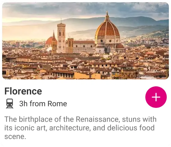
Destination details
Interest tags
Transport focus
It was important to remember Rome2Rio’s core strength
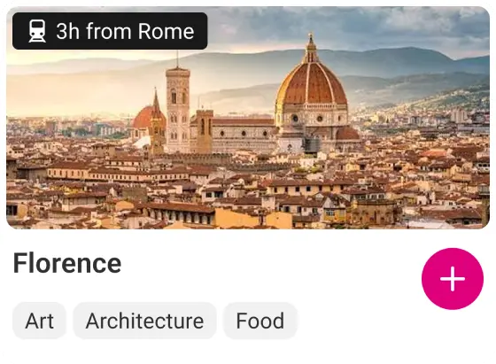
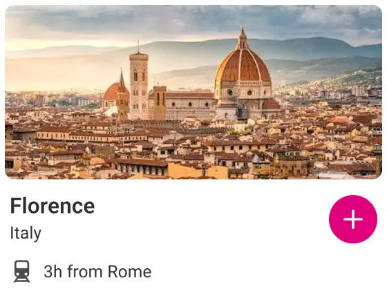
With the MVP validated, I considered what information would help travellers choose a destination. I explored ideas such as destination summaries and interest tags. Working with engineering helped define what was possible, leading us to focus on transport information. This reduced implementation complexity while focusing on Rome2Rio's core strength: showing travellers not just where they could go, but how to get there.
End of trip default
Traveller decides
User testing also revealed important insights
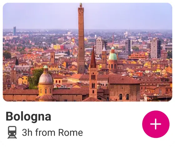
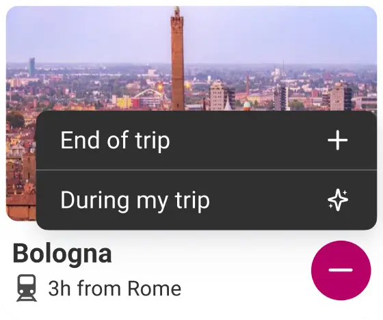
With transport information included, I needed to understand where in a trip a recommended destination should be added. Should it go at the end or at the best point in the existing route? I tested four design variants on UserTesting. Travellers consistently preferred destinations being added at the best point in their route. Even participants who had not seen the behaviour suggested the interaction.
An A/B experiment confirmed map recommendations increased trip planning
Following successful user testing, the feature was released as an A/B experiment. Results showed strong engagement with map recommendations and an increase in multi-stop trip planning. Travellers were more likely to add destinations that fitted naturally into their existing itinerary.
13%
of travellers hovered over destination pins
12%
increase in multi-stop planning sessions
8%
of multi-stop sessions added a destination via map pins
Reflection
This initiative reinforced the importance of close collaboration between design and engineering. The workshop created a shared understanding of the problem, helping us balance user needs with technical possibilities.
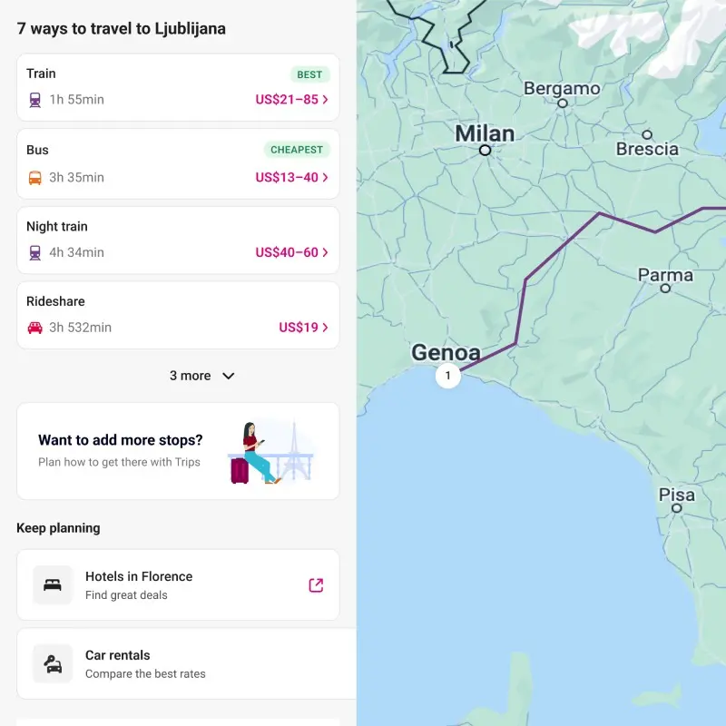
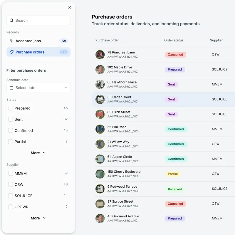

Recommended destinations
Help travellers discover new destinations to add to their Rome2Rio trip plan
13%
of travellers hovered over destination pins
12%
increase in multi-stop planning sessions
8%
of multi-stop sessions added a destination via map pins
How do you help travellers find their next destination?
As part of the broader effort to increase engagement with Rome2Rio's trip planner, I led the design of a feature to help travellers discover new destinations for their trip. When travellers planned trips with three or more destinations, the product performed well. The challenge was helping more travellers add destinations.
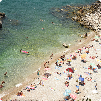
Images drive destination decisions
I conducted background research on travel advice forums and subreddits to understand how travellers choose destinations. Images played a significant part in the decision making process. People were not just choosing a place because of their interests and its location, they were choosing destinations because they looked visually appealing.
Trip details pane ideation
Lofi map card with transport info
Compressed map card
Google map exploration
Concepts utilised images alongside travel time data
Benchmarking map-based competitors informed early ideation. Concepts focused on map interaction that revealed destination details, with images and the travel time between a traveller's previous destination and the recommended next destination. The travel time was included to demonstrate the value of Rome2Rio's transport data when planning trips.
I aligned the team around a map-based approach
To further explore the problem space, I organised a cross-functional ideation workshop that examined how to help travellers add destinations to their trip plans. We explored how improving the trip plan, destination pages, and map interaction could engage travellers.
Workshop ideations
After synthesising ideas from the workshop, I presented the recommended approach to the Product Manager. Map-based visualisation emerged as the strongest opportunity, with hover cards surfacing destination images and transport information.
MVP approach
An early MVP A/B experiment proved promising
To determine whether travellers would utilise map recommendations, we released a Minimum Viable Product (MVP) as part of an A/B experiment. The design was simplified to focus solely on place names, to match our development capacity. The MVP demonstrated promising results, leading to further exploration of map recommendations.
Destination details
Interest tags
Transport focus
It was important to remember Rome2Rio’s core strength
With the MVP validated, I considered what information would help travellers choose a destination. I explored ideas such as destination summaries and interest tags. Working with engineering helped define what was possible, leading us to focus on transport information. This reduced implementation complexity while focusing on Rome2Rio's core strength: showing travellers not just where they could go, but how to get there.
End of trip default
Traveller decides
User testing also revealed important insights
With transport information included, I needed to understand where in a trip a recommended destination should be added. Should it go at the end or at the best point in the existing route? I tested four design variants on UserTesting. Travellers consistently preferred destinations being added at the best point in their route. Even participants who had not seen the behaviour suggested the interaction.
An A/B experiment confirmed map recommendations increased trip planning
Following successful user testing, the feature was released as an A/B experiment. Results showed strong engagement with map recommendations and an increase in multi-stop trip planning. Travellers were more likely to add destinations that fitted naturally into their existing itinerary.
13%
of travellers hovered over destination pins
12%
increase in multi-stop planning sessions
8%
of multi-stop sessions added a destination via map pins
Reflection
This initiative reinforced the importance of close collaboration between design and engineering. The workshop created a shared understanding of the problem, helping us balance user needs with technical possibilities.
Considering travellers’ needs
Discover why Rome2Rio's multi-stop trip planner was not engaging travellers
Building foundations
Create UPowr's design system to support three products with a shared, scalable foundation
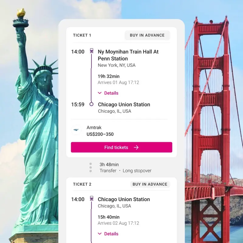
Understanding connected schedules
Help travellers understand how to take a connected journey on Rome2Rio

Recommended destinations
Help travellers discover new destinations to add to their Rome2Rio trip plan
13%
of travellers hovered over destination pins
12%
increase in multi-stop planning sessions
8%
of multi-stop sessions added a destination via map pins
How do you help travellers find their next destination?
As part of the broader effort to increase engagement with Rome2Rio's trip planner, I led the design of a feature to help travellers discover new destinations for their trip. When travellers planned trips with three or more destinations, the product performed well. The challenge was helping more travellers add destinations.
Images drive destination decisions
I conducted background research on travel advice forums and subreddits to understand how travellers choose destinations. Images played a significant part in the decision making process. People were not just choosing a place because of their interests and its location, they were choosing destinations because they looked visually appealing.
Trip details pane ideation
Lofi map card with transport info
Compressed map card
Google map exploration
Concepts utilised images alongside travel time data
Benchmarking map-based competitors informed early ideation. Concepts focused on map interaction that revealed destination details, with images and the travel time between a traveller's previous destination and the recommended next destination. The travel time was included to demonstrate the value of Rome2Rio's transport data when planning trips.
I aligned the team around a map-based approach
To further explore the problem space, I organised a cross-functional ideation workshop that examined how to help travellers add destinations to their trip plans. We explored how improving the trip plan, destination pages, and map interaction could engage travellers.
Workshop ideations
After synthesising ideas from the workshop, I presented the recommended approach to the Product Manager. Map-based visualisation emerged as the strongest opportunity, with hover cards surfacing destination images and transport information.
MVP approach
An early MVP A/B experiment proved promising
To determine whether travellers would utilise map recommendations, we released a Minimum Viable Product (MVP) as part of an A/B experiment. The design was simplified to focus solely on place names, to match our development capacity. The MVP demonstrated promising results, leading to further exploration of map recommendations.
Destination details
Interest tags
Transport focus
It was important to remember Rome2Rio’s core strength
With the MVP validated, I considered what information would help travellers choose a destination. I explored ideas such as destination summaries and interest tags. Working with engineering helped define what was possible, leading us to focus on transport information. This reduced implementation complexity while focusing on Rome2Rio's core strength: showing travellers not just where they could go, but how to get there.
End of trip default
Traveller decides
User testing also revealed important insights
With transport information included, I needed to understand where in a trip a recommended destination should be added. Should it go at the end or at the best point in the existing route? I tested four design variants on UserTesting. Travellers consistently preferred destinations being added at the best point in their route. Even participants who had not seen the behaviour suggested the interaction.
An A/B experiment confirmed map recommendations increased trip planning
Following successful user testing, the feature was released as an A/B experiment. Results showed strong engagement with map recommendations and an increase in multi-stop trip planning. Travellers were more likely to add destinations that fitted naturally into their existing itinerary.
13%
of travellers hovered over destination pins
12%
increase in multi-stop planning sessions
8%
of multi-stop sessions added a destination via map pins
Reflection
This initiative reinforced the importance of close collaboration between design and engineering. The workshop created a shared understanding of the problem, helping us balance user needs with technical possibilities.