Understanding connected schedules
Help travellers understand how to take a connected journey on Rome2Rio
25%
increase in operator content interactions
2.5%
increase in transport bookings
2%
decrease in site exits


Connected journeys confused travellers
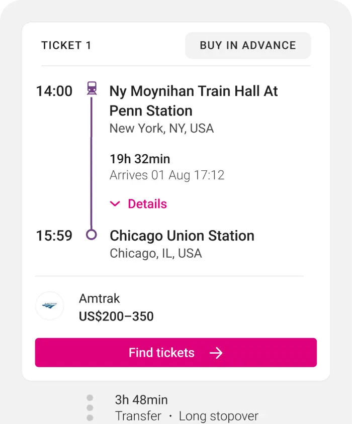
Rome2Rio's connected routes combine separate tickets and often multiple operators into a single journey. This kind of experience is rare online and consistently confused travellers. They could not identify who operated each segment, understand how to purchase tickets, or make sense of why some options could not be booked at all.
Baseline designed by another designer

When I click find tickets is that going to be tickets for the whole journey
User testing participant
Three pain points
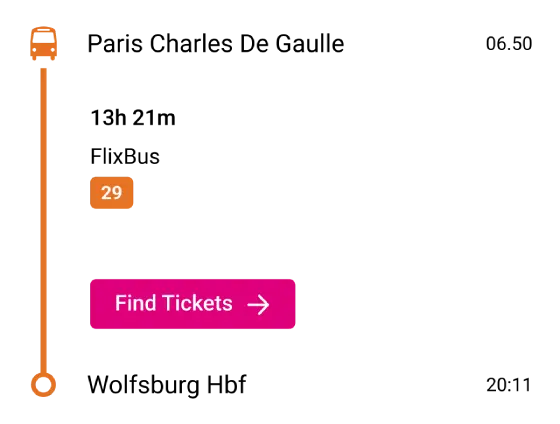
By reviewing existing user interviews and the initial designs, I identified three core pain points: travel times and duration were unclear, ticket purchasing options were confusing. And there was no clear way to communicate that each part of their connected journey needed to be booked separately.
Baseline
Detailed
Compressed
Progressive disclosure and proximity improved user experience
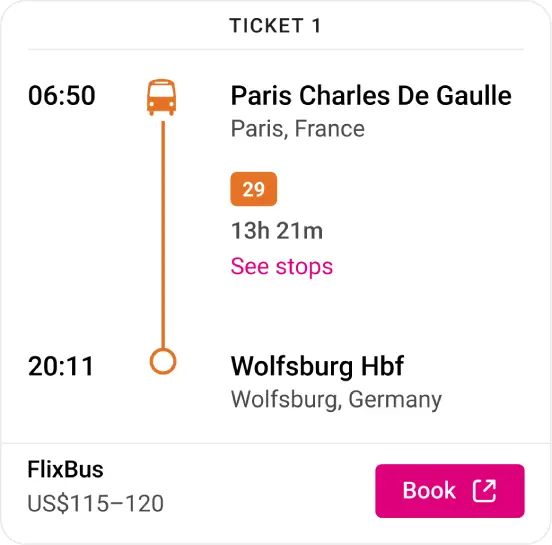
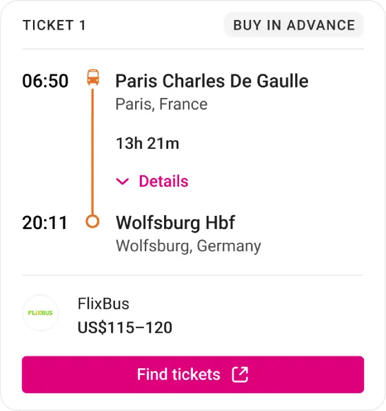
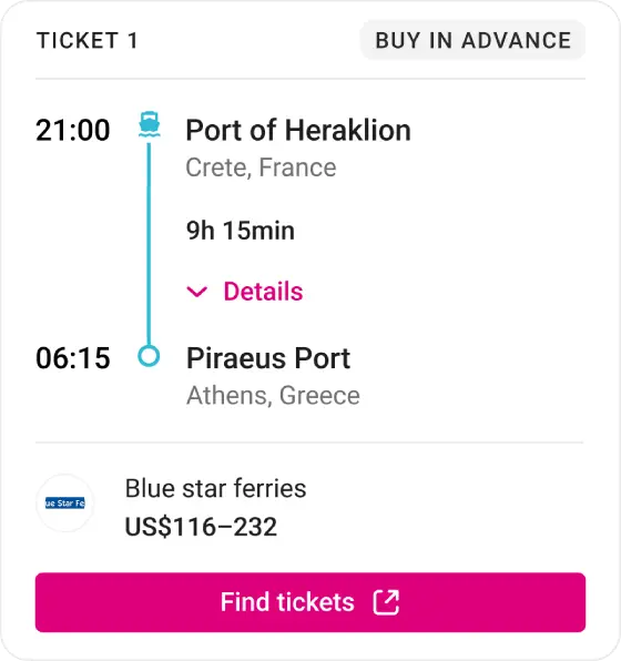
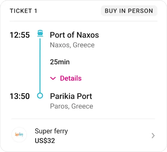
Drawing on feedback from the Content Designer and Conversion Pod's Senior Product Designer, I iterated the timeline to improve visual hierarchy of travel times. I then explored surfacing operator details alongside the relevant route segment. The law of proximity shaped ideation; I introduced a card design for each segment to link purchasing information and operator details.
Bookable ticket
Non-bookable ticket
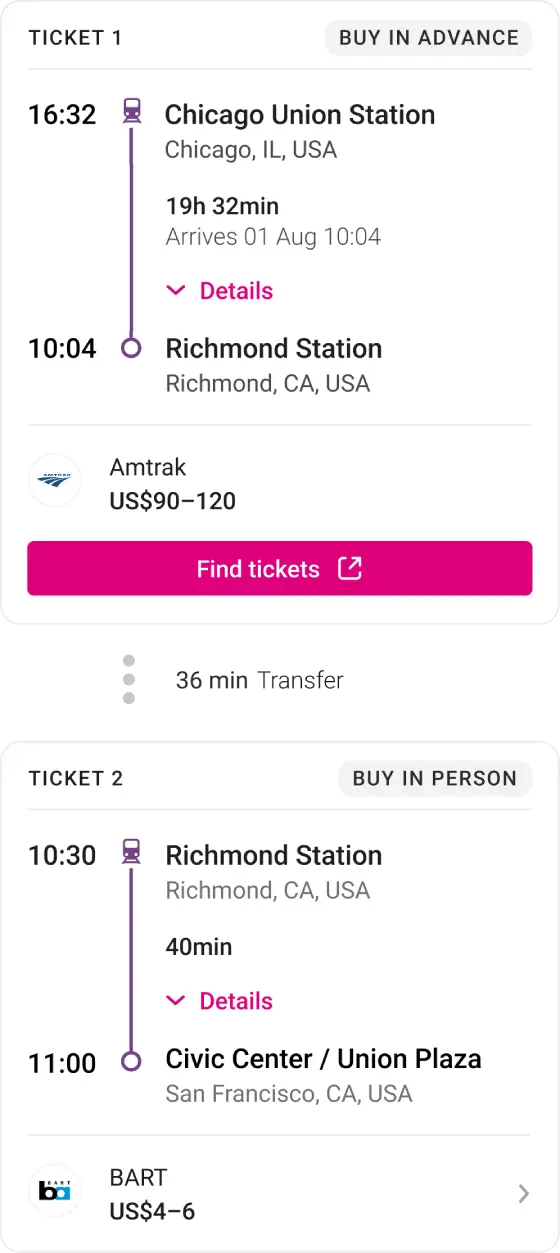
Where a ticket could be purchased, a primary CTA was introduced. When it could not be, operator details were shown, giving travellers the information they needed to book directly. Ticket purchasing tags were introduced to provide an overview of how to travel on the connected journey without opening operator details.
Journey
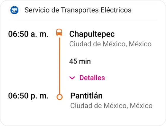

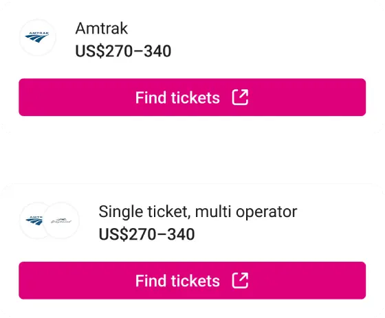
1 ticket multi-parts
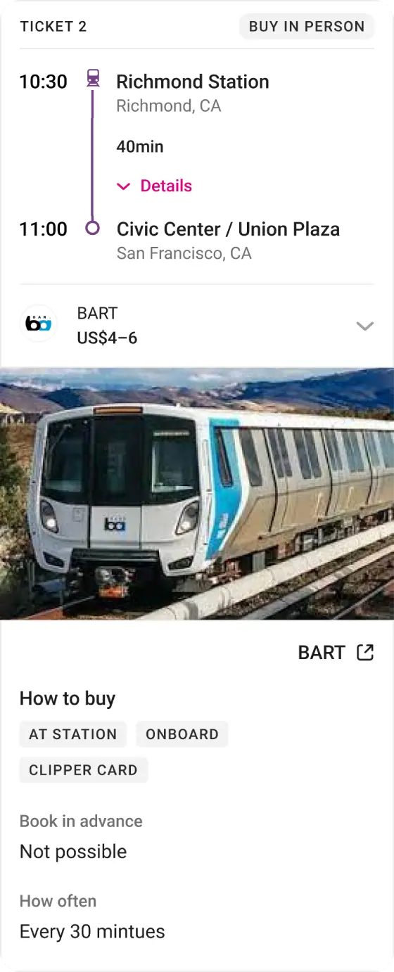
Expanded operator details
100% of tested travellers preferred the new design
I ran unmoderated A/B testing with eight travellers from the US and mainland Europe, all familiar with Rome2Rio and planning a European trip involving trains or buses. The sessions surfaced key insights about how travellers understood the experience.
Progressive disclosure gave travellers control over how much detail they engaged with. The law of proximity linked operator details to the right parts of the journey. All eight preferred the updated design over what was live. Following these sessions, minor UI refinements were made. A trip summary was added to the top of the page after travellers expressed its importance.
Experiment variants
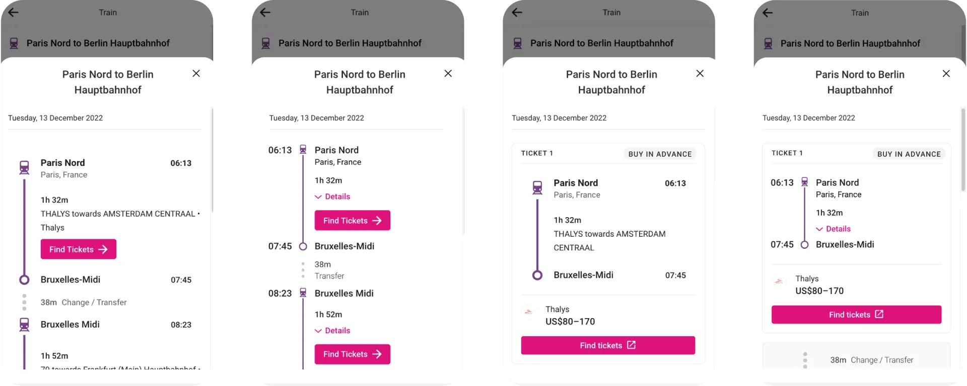
60-70% more travellers interacted with operator content in the A/B experiment
The designs were released to the product as an A/B experiment across four variants. The card design drove 60-70% more engagement with operator details and the updated timeline improved hotel interactions by 16%.
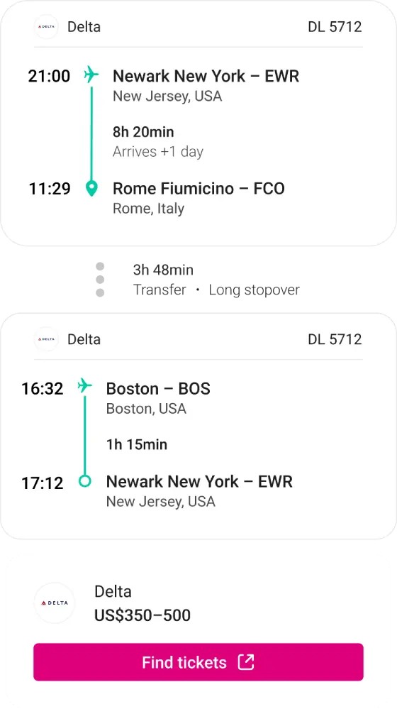
Flights refinement
One issue that emerged was that the full-page design was reducing conversion rates for flights. I examined how competitors presented flight information and discovered a consistently simpler approach. By reducing the amount of detail provided, we improved visibility and brought conversion rates back in line with other transportation modes.
It just helped spell things out a little bit more. So I didn't have to take the time to do additional research, of how I need to buy those tickets for all those three journeys
User testing participant
Less confusion led to higher engagement
The redesign led to a 25% increase in operator content interactions, a 2.5% increase in transport bookings, and a 2% decrease in site exits. The increase in interactions revealed travellers were engaging with operator content rather than ignoring it. The decrease in exits showed they were staying on Rome2Rio rather than leaving out of confusion, which was previously a significant concern for connected routes.
25%
increase in operator content interactions
2.5%
increase in transport bookings
2%
decrease in site exits
Reflection
By carefully reviewing data I was able to identify three clear pain points and develop solutions that could be implemented before handing designs over to development. By the time the change went live, every design decision was backed up by clear evidence.

Understanding connected schedules
Help travellers understand how to take a connected journey on Rome2Rio
25%
increase in operator content interactions
2.5%
increase in transport bookings
2%
decrease in site exits

Connected journeys confused travellers
Rome2Rio's connected routes combine separate tickets and often multiple operators into a single journey. This kind of experience is rare online and consistently confused travellers. They could not identify who operated each segment, understand how to purchase tickets, or make sense of why some options could not be booked at all.
When I click find tickets is that going to be tickets for the whole journey
User testing participant
Baseline designed by another designer
Three pain points
By reviewing existing user interviews and the initial designs, I identified three core pain points: travel times and duration were unclear, ticket purchasing options were confusing. And there was no clear way to communicate that each part of their connected journey needed to be booked separately.
Baseline
Detailed
Compressed
Progressive disclosure and proximity improved user experience
Drawing on feedback from the Content Designer and Conversion Pod's Senior Product Designer, I iterated the timeline to improve visual hierarchy of travel times. I then explored surfacing operator details alongside the relevant route segment. The law of proximity shaped ideation; I introduced a card design for each segment to link purchasing information and operator details.
Bookable ticket
Non-bookable ticket
Where a ticket could be purchased, a primary CTA was introduced. When it could not be, operator details were shown, giving travellers the information they needed to book directly. Ticket purchasing tags were introduced to provide an overview of how to travel on the connected journey without opening operator details.
Journey
1 ticket multi-parts
Expanded operator details
100% of tested travellers preferred the new design
I ran unmoderated A/B testing with eight travellers from the US and mainland Europe, all familiar with Rome2Rio and planning a European trip involving trains or buses. The sessions surfaced key insights about how travellers understood the experience.
Progressive disclosure gave travellers control over how much detail they engaged with. The law of proximity linked operator details to the right parts of the journey. All eight preferred the updated design over what was live. Following these sessions, minor UI refinements were made. A trip summary was added to the top of the page after travellers expressed its importance.
Experiment variants
60-70% more travellers interacted with operator content in the A/B experiment
The designs were released to the product as an A/B experiment across four variants. The card design drove 60-70% more engagement with operator details and the updated timeline improved hotel interactions by 16%.
Flights refinement
One issue that emerged was that the full-page design was reducing conversion rates for flights. I examined how competitors presented flight information and discovered a consistently simpler approach. By reducing the amount of detail provided, we improved visibility and brought conversion rates back in line with other transportation modes.
It just helped spell things out a little bit more. So I didn't have to take the time to do additional research, of how I need to buy those tickets for all those three journeys
User testing participant
Less confusion led to higher engagement
The redesign led to a 25% increase in operator content interactions, a 2.5% increase in transport bookings, and a 2% decrease in site exits. The increase in interactions revealed travellers were engaging with operator content rather than ignoring it. The decrease in exits showed they were staying on Rome2Rio rather than leaving out of confusion, which was previously a significant concern for connected routes.
25%
increase in operator content interactions
2.5%
increase in transport bookings
2%
decrease in site exits
Reflection
By carefully reviewing data I was able to identify three clear pain points and develop solutions that could be implemented before handing designs over to development. By the time the change went live, every design decision was backed up by clear evidence.

Understanding connected schedules
Help travellers understand how to take a connected journey on Rome2Rio
25%
increase in operator content interactions
2.5%
increase in transport bookings
2%
decrease in site exits
Connected journeys confused travellers
Rome2Rio's connected routes combine separate tickets and often multiple operators into a single journey. This kind of experience is rare online and consistently confused travellers. They could not identify who operated each segment, understand how to purchase tickets, or make sense of why some options could not be booked at all.

When I click find tickets is that going to be tickets for the whole journey
User testing participant
Baseline designed by another designer
Three pain points
By reviewing existing user interviews and the initial designs, I identified three core pain points: travel times and duration were unclear, ticket purchasing options were confusing. And there was no clear way to communicate that each part of their connected journey needed to be booked separately.
Baseline
Detailed
Compressed
Progressive disclosure and proximity improved user experience
Drawing on feedback from the Content Designer and Conversion Pod's Senior Product Designer, I iterated the timeline to improve visual hierarchy of travel times. I then explored surfacing operator details alongside the relevant route segment. The law of proximity shaped ideation; I introduced a card design for each segment to link purchasing information and operator details.
Bookable ticket
Non-bookable ticket
Where a ticket could be purchased, a primary CTA was introduced. When it could not be, operator details were shown, giving travellers the information they needed to book directly. Ticket purchasing tags were introduced to provide an overview of how to travel on the connected journey without opening operator details.
Journey
1 ticket multi-parts
Expanded operator details
100% of tested travellers preferred the new design
I ran unmoderated A/B testing with eight travellers from the US and mainland Europe, all familiar with Rome2Rio and planning a European trip involving trains or buses. The sessions surfaced key insights about how travellers understood the experience.
Progressive disclosure gave travellers control over how much detail they engaged with. The law of proximity linked operator details to the right parts of the journey. All eight preferred the updated design over what was live. Following these sessions, minor UI refinements were made. A trip summary was added to the top of the page after travellers expressed its importance.
Experiment variants
60-70% more travellers interacted with operator content in the A/B experiment
The designs were released to the product as an A/B experiment across four variants. The card design drove 60-70% more engagement with operator details and the updated timeline improved hotel interactions by 16%.
Flights refinement
One issue that emerged was that the full-page design was reducing conversion rates for flights. I examined how competitors presented flight information and discovered a consistently simpler approach. By reducing the amount of detail provided, we improved visibility and brought conversion rates back in line with other transportation modes.
It just helped spell things out a little bit more. So I didn't have to take the time to do additional research, of how I need to buy those tickets for all those three journeys
User testing participant
Less confusion led to higher engagement
The redesign led to a 25% increase in operator content interactions, a 2.5% increase in transport bookings, and a 2% decrease in site exits. The increase in interactions revealed travellers were engaging with operator content rather than ignoring it. The decrease in exits showed they were staying on Rome2Rio rather than leaving out of confusion, which was previously a significant concern for connected routes.
25%
increase in operator content interactions
2.5%
increase in transport bookings
2%
decrease in site exits
Reflection
By carefully reviewing data I was able to identify three clear pain points and develop solutions that could be implemented before handing designs over to development. By the time the change went live, every design decision was backed up by clear evidence.