
Considering travellers’ needs
Discover why Rome2Rio's multi-stop trip planner was not engaging travellers
35x
more trip planning engagement after the separation
167k
monthly multi-stop trips created post separation
850k
monthly trip plan updates post separation

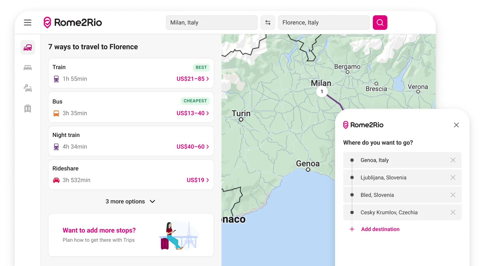
A new core experience that helps travellers plan multi-stop trips
Rome2Rio is a global travel planning platform with over 55 million monthly users. For its dedicated traveller base, it is seen as a trusted planning tool that they continually return to as their travel plans take shape. With a vision to help travellers plan their whole trip, a new roadmap was introduced to transform the product from an A-B search experience to a multi-stop trip planner.
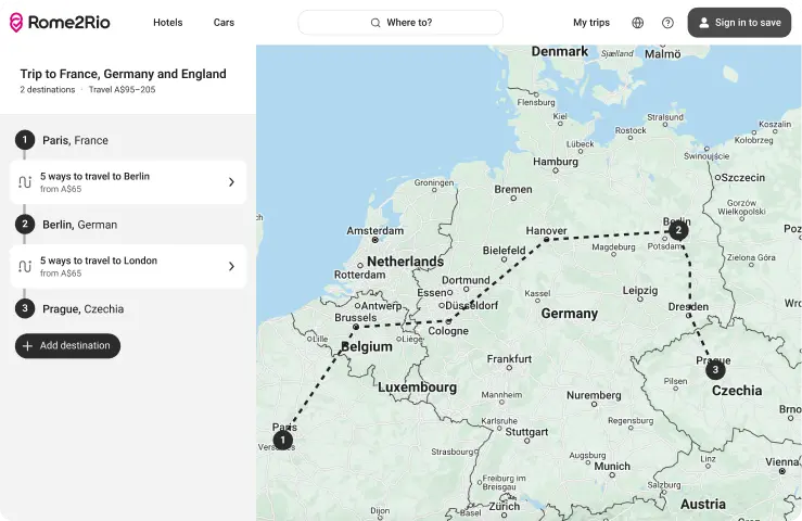
MVP designed by another designer
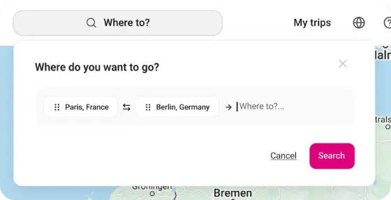
Search dropdown
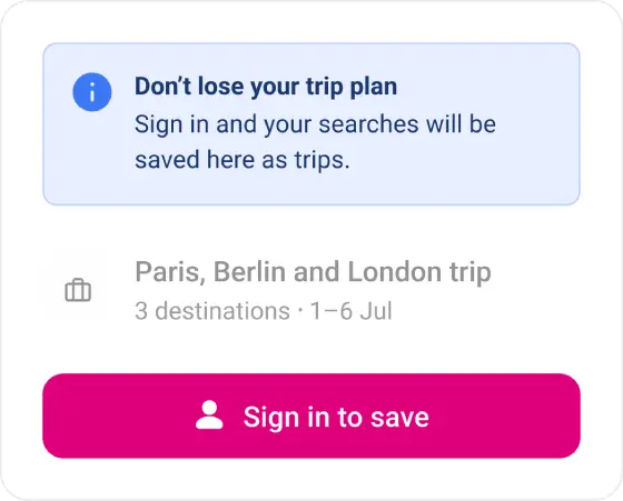
My trips with log in prompt
98% of travellers were still performing simple A-B searches
As the trip planner core experiment went live, traveller satisfaction scores noticeably dropped. To understand why, I watched hundreds of Hotjar session recordings, then partnered with our Data Scientist to quantify the behaviour. We found that 98% of travellers in the multi-stop variant were still performing simple A-B searches. The product had been redesigned towards a behaviour that very few travellers were exhibiting.
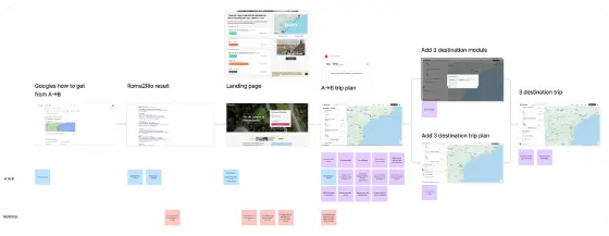
Journey mapping
Visible search fields

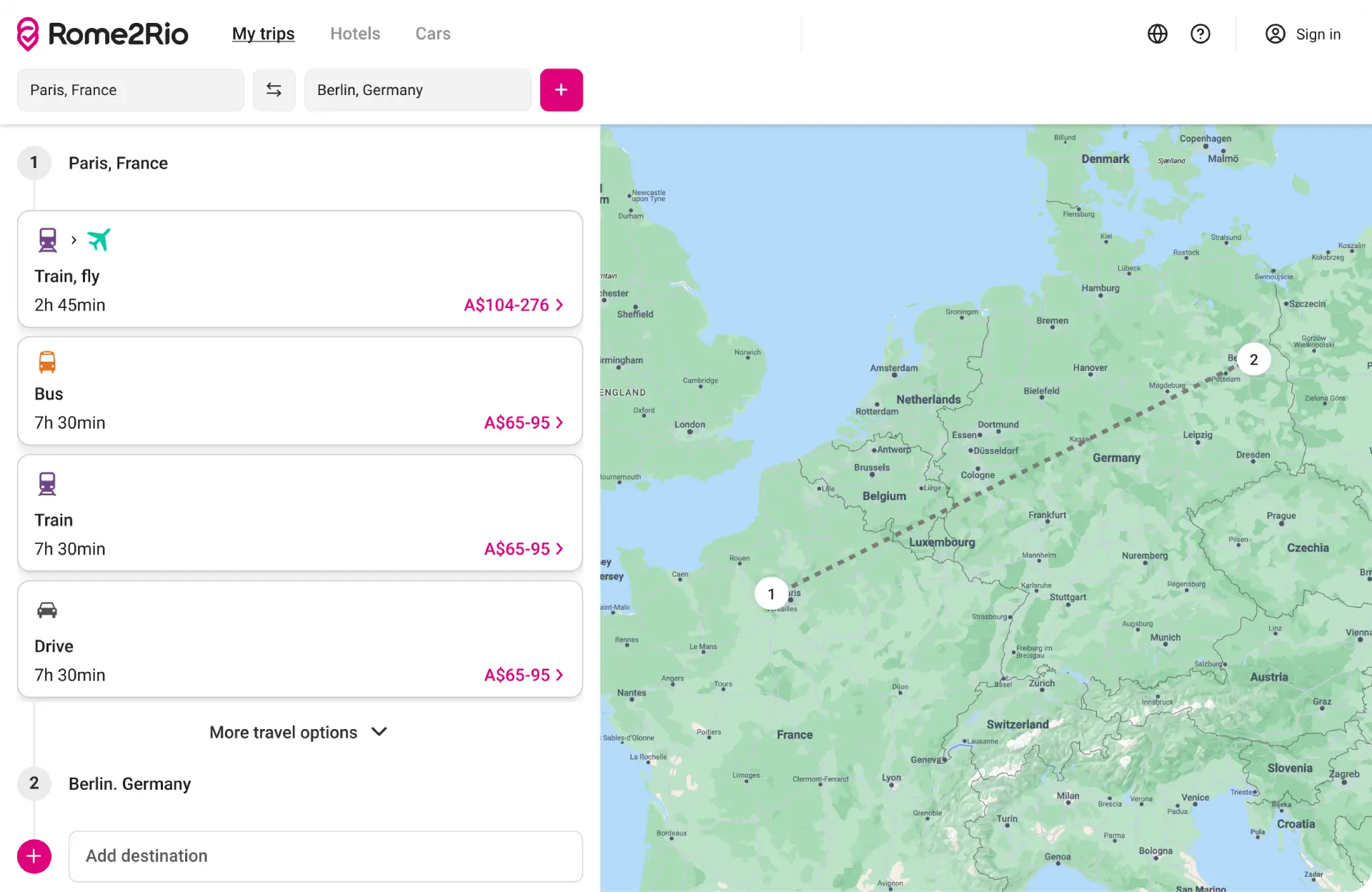
Simplified experience for A-B travellers
Simplifying the A-B experience led to happier travellers.
Mapping the A-B travellers’ journey against the trip planning core experience showed clear pains, gains and opportunities. I designed a new approach that introduced a visible search bar and focused on transport options. These changes were released incrementally to the product as A/B experiments. Leading to improved traveller satisfaction and reduction in frustrations shared by travellers.
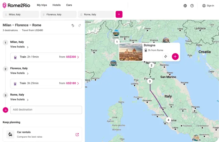
Recommend destinations
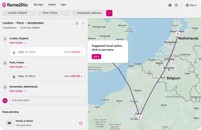
Suggest transport
The trip planner produced results, but only when the audience engaged
To help transform Rome2Rio from an A-B search experience to a trip planning platform, I designed initiatives including saving multiple trips, suggested transport and recommended destinations. These initiatives were successful. Quantitative data showed that travellers who triggered a trip with three or more destinations were significantly more engaged.
4-10x
higher booking rates
6x
greater engagement
5x
longer session durations
However, the majority of travellers were still using Rome2Rio for simple A-B searches.
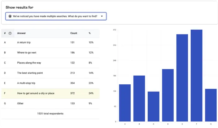
Hotjar survey results
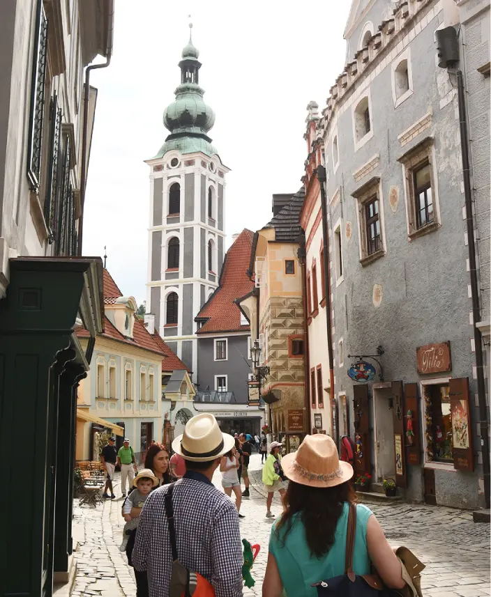
60% of multi-stop trip planners were unaware they could add more destinations
I developed a Hotjar survey that triggered after a traveller made multiple searches. It revealed that most travellers were planning multi-stop trips. When asked why they weren’t using Rome2Rio to do so, 60% were unaware they could add more than two destinations.
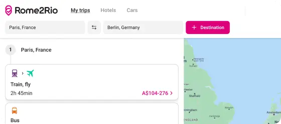
Primary add destination CTA
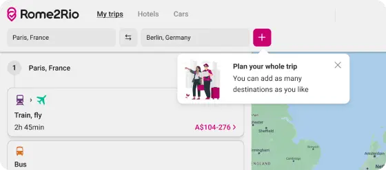
Prompt after 2 or more searches
Discoverability was not the barrier
I designed solutions to improve discoverability, which were released to the product as an A/B experiment. Improving the visual hierarchy of the add destination feature did not significantly increase the number of travellers becoming multi-stop trip planners, suggesting that discoverability was not the problem.There was another reason why A/B travellers were not planning multistop trips.

It is unbelievable. It is the GPS of a planet.
American traveller
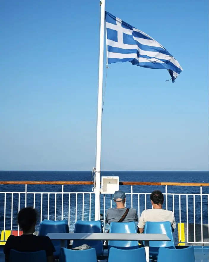
Travellers had already solved multi-stop trip planning in their own way
I led 9 qualitative interviews with travellers recruited through the Hotjar survey. The conversations revealed something beyond a usability problem.
Multi-stop trip travellers were already planning across spreadsheets, documents, social media, notebooks and calendars, moving freely between physical and digital tools depending on what felt right for each decision. They valued the freedom to decide what information was important to them.
Interactive user journey showing how Americans plan
Rather than a planning tool, Rome2Rio was a trusted companion alongside a broader ecosystem of products. The new product assumed a problem that travellers had already solved in their own way. I presented these findings to my cross-functional team and the wider product team.
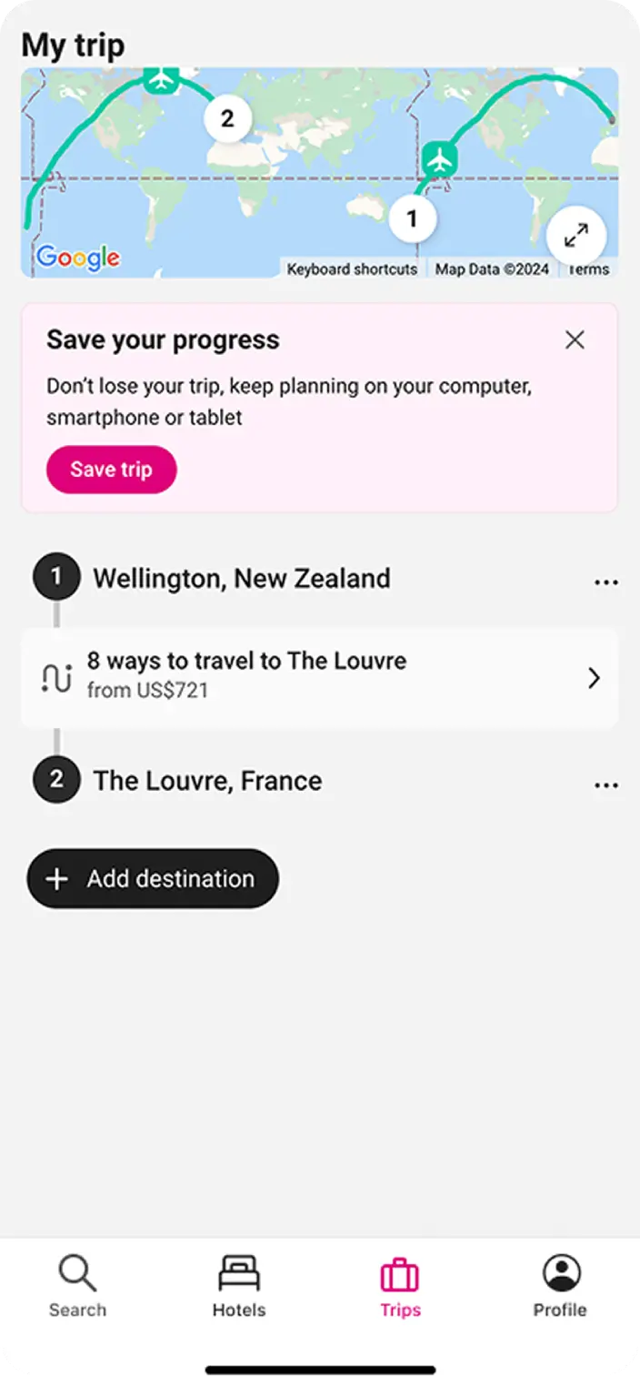
MVP
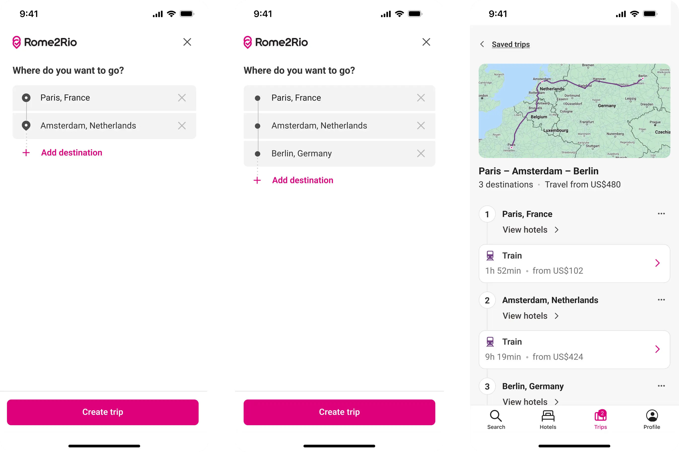
Mobile onboarding flow
The mobile experience revealed what was actually working
To allow for quick ideation and delivery the multi-stop trip planner core experience was never released to mobile. Mobile remained an A-B search with a separate trip planning experience accessed through a bottom tab bar and a search entry point. Even as a minimum viable product (MVP) without the additional features released to desktop, mobile trip planners were noticeably more engaged.
Review MVP mobile functionally
I collaborated with our Data Scientist to quantify this data. Only 0.01% of travellers entered the trip planner through search; the majority used the tab bar. When travellers entered the trip planner with purpose, they stayed. When they arrived through a search without that intent, they did not. Based on these insights, I advocated for and was approved to keep the experiences separate on mobile.
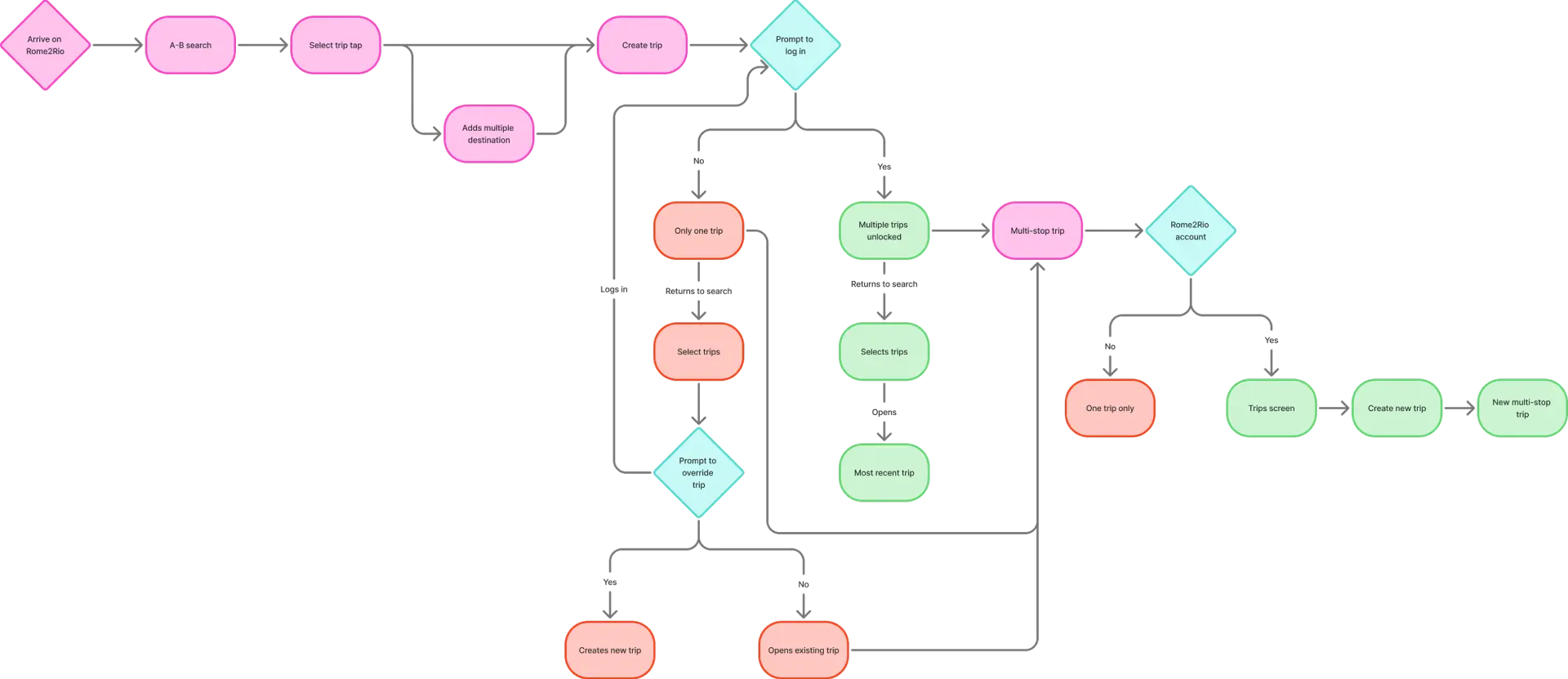
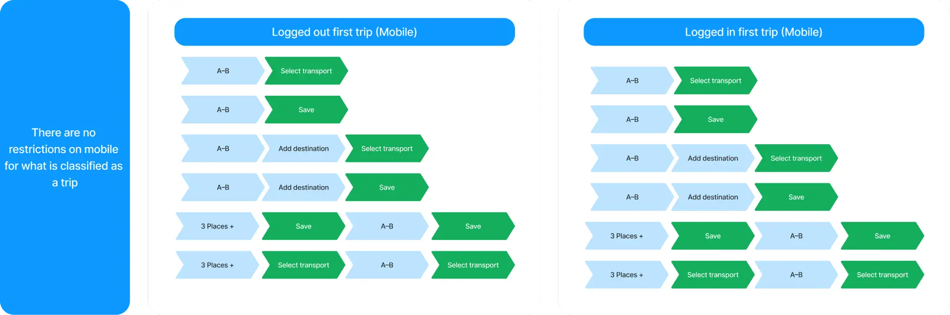
Saving flow
But cross-platform consistency and saving flow was a pain point
I was tasked with creating parity between desktop and mobile. Mapping manual and automatic saving flows revealed usability concerns as they were inconsistent with the desktop core experience. To create consistency, I defined logged-out and logged-in user flows, explored entry point designs, and designed high-fidelity mobile onboarding for travellers entering the trip planner through the tab bar.
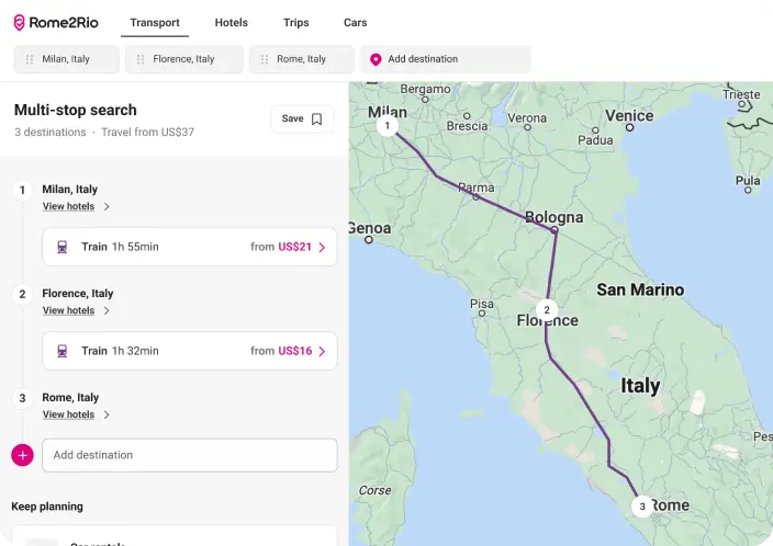
Core multi-stop search experience
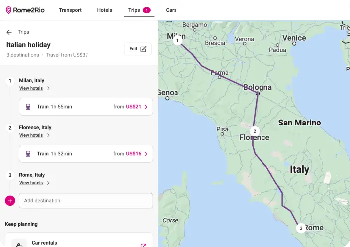
Saved multi-stop trips
User testing highlighted the need for separate desktop experiences
Usability testing revealed significant pain points: travellers could not distinguish between a multi-stop search and a saved trip, struggled to navigate between the two, and did not understand how to create or return to a saved trip.
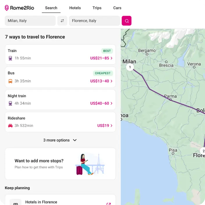
A-B search core experience
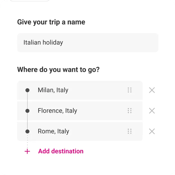
Multi-stop trip search screen
Over five days, I tested and iterated, eventually exploring a separate A-B search and trip planning experience. With this iteration, travellers understood the distinction between searches and saved trips, navigated easily between the two, and could see the value of both. Based on the mobile data, the research findings, and the desktop testing results, I presented the case for separation experiences on desktop to the Product Manager and Principal Designer.
Leadership recognised the need to reverse strategy
We presented the qualitative and quantitative data to leadership at our mid-quarter OKR check-in, recommending that Rome2Rio revert to an A-B search core experience with a separate trip planning experience. Leadership approved the change. Rome2Rio reverted to an A-B search core experience, with trip planning as a separate feature.
35x
more trip planning engagement after the separation
167k
monthly multi-stop trips created post separation
850k
monthly trip plan updates post separation
Reflection
Although I had reservations about the trip planning core experience from the start, I aligned with the roadmap, delivering work that had a significant business impact. I followed the data to understand why travellers were not engaging with the trip planning core experience.
This approach reinforced the importance of taking others along the journey to drive meaningful change, highlighting the value of strategic alignment, discovery research, advocacy for users, and data-driven decisions in product development.

Considering travellers’ needs
Discover why Rome2Rio's multi-stop trip planner was not engaging travellers
35x
more trip planning engagement after the separation
167k
monthly multi-stop trips created post separation
850k
monthly trip plan updates post separation
A new core experience that helps travellers plan multi-stop trips
Rome2Rio is a global travel planning platform with over 55 million monthly users. For its dedicated traveller base, it is seen as a trusted planning tool that they continually return to as their travel plans take shape. With a vision to help travellers plan their whole trip, a new roadmap was introduced to transform the product from an A-B search experience to a multi-stop trip planner.
MVP designed by another designer
Search dropdown
My trips with log in prompt
98% of travellers were still performing simple A-B searches
As the trip planner core experiment went live, traveller satisfaction scores noticeably dropped. To understand why, I watched hundreds of Hotjar session recordings, then partnered with our Data Scientist to quantify the behaviour. We found that 98% of travellers in the multi-stop variant were still performing simple A-B searches. The product had been redesigned towards a behaviour that very few travellers were exhibiting.
Journey mapping
Visible search fields
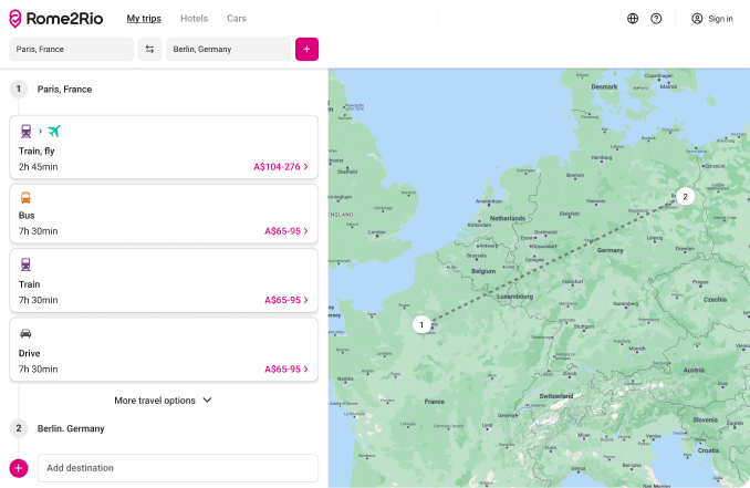
Simplified experience for A-B travellers
Simplifying the A-B experience led to happier travellers.
Mapping the A-B travellers’ journey against the trip planning core experience showed clear pains, gains and opportunities. I designed a new approach that introduced a visible search bar and focused on transport options. These changes were released incrementally to the product as A/B experiments. Leading to improved traveller satisfaction and reduction in frustrations shared by travellers.
Recommend destinations
Suggest transport
The trip planner produced results, but only when the audience engaged
To help transform Rome2Rio from an A-B search experience to a trip planning platform, I designed initiatives including saving multiple trips, suggested transport and recommended destinations. These initiatives were successful. Quantitative data showed that travellers who triggered a trip with three or more destinations were significantly more engaged.
4-10x
higher booking rates
6x
greater engagement
5x
longer session durations
However, the majority of travellers were still using Rome2Rio for simple A-B searches.
Hotjar survey results
60% of multi-stop trip planners were unaware they could add more destinations
I developed a Hotjar survey that triggered after a traveller made multiple searches. It revealed that most travellers were planning multi-stop trips. When asked why they weren’t using Rome2Rio to do so, 60% were unaware they could add more than two destinations.
Primary add destination CTA
Prompt after 2 or more searches
Discoverability was not the barrier
I designed solutions to improve discoverability, which were released to the product as an A/B experiment. Improving the visual hierarchy of the add destination feature did not significantly increase the number of travellers becoming multi-stop trip planners, suggesting that discoverability was not the problem.There was another reason why A/B travellers were not planning multistop trips.
It is unbelievable. It is the GPS of a planet.
American traveller
Travellers had already solved multi-stop trip planning in their own way
I led 9 qualitative interviews with travellers recruited through the Hotjar survey. The conversations revealed something beyond a usability problem.
Multi-stop trip travellers were already planning across spreadsheets, documents, social media, notebooks and calendars, moving freely between physical and digital tools depending on what felt right for each decision. They valued the freedom to decide what information was important to them.
Interactive user journey showing how Americans plan
Rather than a planning tool, Rome2Rio was a trusted companion alongside a broader ecosystem of products. The new product assumed a problem that travellers had already solved in their own way. I presented these findings to my cross-functional team and the wider product team.
MVP designed by another designer
Mobile onboarding flow
The mobile experience revealed what was actually working
To allow for quick ideation and delivery the multi-stop trip planner core experience was never released to mobile. Mobile remained an A-B search with a separate trip planning experience accessed through a bottom tab bar and a search entry point. Even as a minimum viable product (MVP) without the additional features released to desktop, mobile trip planners were noticeably more engaged.
Review MVP mobile functionally
I collaborated with our Data Scientist to quantify this data. Only 0.01% of travellers entered the trip planner through search; the majority used the tab bar. When travellers entered the trip planner with purpose, they stayed. When they arrived through a search without that intent, they did not. Based on these insights, I advocated for and was approved to keep the experiences separate on mobile.
Saving flow
But cross-platform consistency and saving flow was a pain point
I was tasked with creating parity between desktop and mobile. Mapping manual and automatic saving flows revealed usability concerns as they were inconsistent with the desktop core experience. To create consistency, I defined logged-out and logged-in user flows, explored entry point designs, and designed high-fidelity mobile onboarding for travellers entering the trip planner through the tab bar.
Core multi-stop search experience
Saved multi-stop trips
User testing highlighted the need for separate desktop experiences
Usability testing revealed significant pain points: travellers could not distinguish between a multi-stop search and a saved trip, struggled to navigate between the two, and did not understand how to create or return to a saved trip.
A-B search core experience
Multi-stop trip search screen
Over five days, I tested and iterated, eventually exploring a separate A-B search and trip planning experience. With this iteration, travellers understood the distinction between searches and saved trips, navigated easily between the two, and could see the value of both. Based on the mobile data, the research findings, and the desktop testing results, I presented the case for separation experiences on desktop to the Product Manager and Principal Designer.
Leadership recognised the need to reverse strategy
We presented the qualitative and quantitative data to leadership at our mid-quarter OKR check-in, recommending that Rome2Rio revert to an A-B search core experience with a separate trip planning experience. Leadership approved the change. Rome2Rio reverted to an A-B search core experience, with trip planning as a separate feature.
35x
more trip planning engagement after the separation
167k
monthly multi-stop trips created post separation
850k
monthly trip plan updates post separation
Reflection
Although I had reservations about the trip planning core experience from the start, I aligned with the roadmap, delivering work that had a significant business impact. I followed the data to understand why travellers were not engaging with the trip planning core experience.
This approach reinforced the importance of taking others along the journey to drive meaningful change, highlighting the value of strategic alignment, discovery research, advocacy for users, and data-driven decisions in product development.

Considering travellers’ needs
Discover why Rome2Rio's multi-stop trip planner was not engaging travellers
35x
more trip planning engagement after the separation
167k
monthly multi-stop trips created post separation
850k
monthly trip plan updates post separation
A new core experience that helps travellers plan multi-stop trips
Rome2Rio is a global travel planning platform with over 55 million monthly users. For its dedicated traveller base, it is seen as a trusted planning tool that they continually return to as their travel plans take shape. With a vision to help travellers plan their whole trip, a new roadmap was introduced to transform the product from an A-B search experience to a multi-stop trip planner.
MVP designed by another designer
Search dropdown
My trips with log in prompt
98% of travellers were still performing simple A-B searches
As the trip planner core experiment went live, traveller satisfaction scores noticeably dropped. To understand why, I watched hundreds of Hotjar session recordings, then partnered with our Data Scientist to quantify the behaviour. We found that 98% of travellers in the multi-stop variant were still performing simple A-B searches. The product had been redesigned towards a behaviour that very few travellers were exhibiting.
Journey mapping
Visible search fields
Simplified experience for A-B travellers
Simplifying the A-B experience led to happier travellers
Mapping the A-B travellers’ journey against the trip planning core experience showed clear pains, gains and opportunities. I designed a new approach that introduced a visible search bar and focused on transport options. These changes were released incrementally to the product as A/B experiments. Leading to improved traveller satisfaction and reduction in frustrations shared by travellers.
Recommend destinations
Suggest transport
The trip planner produced results, but only when the audience engaged
To help transform Rome2Rio from an A-B search experience to a trip planning platform, I designed initiatives including saving multiple trips, suggested transport and recommended destinations. These initiatives were successful. Quantitative data showed that travellers who triggered a trip with three or more destinations were significantly more engaged.
4-10x
higher booking rates
6x
greater engagement
5x
longer session durations
However, the majority of travellers were still using Rome2Rio for simple A-B searches.
Hotjar survey results
60% of multi-stop trip planners were unaware they could add more destinations
I developed a Hotjar survey that triggered after a traveller made multiple searches. It revealed that most travellers were planning multi-stop trips. When asked why they weren’t using Rome2Rio to do so, 60% were unaware they could add more than two destinations.
Primary add destination CTA
Prompt after 2 or more searches
Discoverability was not the barrier
I designed solutions to improve discoverability, which were released to the product as an A/B experiment. Improving the visual hierarchy of the add destination feature did not significantly increase the number of travellers becoming multi-stop trip planners, suggesting that discoverability was not the problem. There was another reason why A/B travellers were not planning multistop trips.

It is unbelievable. It is the GPS of a planet.
American traveller
Travellers had already solved multi-stop trip planning in their own way
I led 9 qualitative interviews with travellers recruited through the Hotjar survey. The conversations revealed something beyond a usability problem.
Multi-stop trip travellers were already planning across spreadsheets, documents, social media, notebooks and calendars, moving freely between physical and digital tools depending on what felt right for each decision. They valued the freedom to decide what information was important to them.
Interactive user journey showing how Americans plan
Rather than a planning tool, Rome2Rio was a trusted companion alongside a broader ecosystem of products. The new product assumed a problem that travellers had already solved in their own way. I presented these findings to my cross-functional team and the wider product team.
MVP designed by another designer
Mobile onboarding flow
The mobile experience revealed what was actually working
To allow for quick ideation and delivery the multi-stop trip planner core experience was never released to mobile. Mobile remained an A-B search with a separate trip planning experience accessed through a bottom tab bar and a search entry point. Even as a minimum viable product (MVP) without the additional features released to desktop, mobile trip planners were noticeably more engaged.
Review MVP mobile functionally
I collaborated with our Data Scientist to quantify this data. Only 0.01% of travellers entered the trip planner through search; the majority used the tab bar. When travellers entered the trip planner with purpose, they stayed. When they arrived through a search without that intent, they did not. Based on these insights, I advocated for and was approved to keep the experiences separate on mobile.
Saving flow
But cross-platform consistency and saving flow was a pain point
I was tasked with creating parity between desktop and mobile. Mapping manual and automatic saving flows revealed usability concerns as they were inconsistent with the desktop core experience. To create consistency, I defined logged-out and logged-in user flows, explored entry point designs, and designed high-fidelity mobile onboarding for travellers entering the trip planner through the tab bar.
Core multi-stop search experience
Saved multi-stop trips
User testing highlighted the need for separate desktop experiences
Usability testing revealed significant pain points: travellers could not distinguish between a multi-stop search and a saved trip, struggled to navigate between the two, and did not understand how to create or return to a saved trip.
A-B search core experience
Multi-stop trip search screen
Over five days, I tested and iterated, eventually exploring a separate A-B search and trip planning experience. With this iteration, travellers understood the distinction between searches and saved trips, navigated easily between the two, and could see the value of both. Based on the mobile data, the research findings, and the desktop testing results, I presented the case for separation experiences on desktop to the Product Manager and Principal Designer.
Leadership recognised the need to reverse strategy
We presented the qualitative and quantitative data to leadership at our mid-quarter OKR check-in, recommending that Rome2Rio revert to an A-B search core experience with a separate trip planning experience. Leadership approved the change. Rome2Rio reverted to an A-B search core experience, with trip planning as a separate feature.
35x
more trip planning engagement after the separation
167k
monthly multi-stop trips created post separation
850k
monthly trip plan updates post separation
Reflection
Although I had reservations about the trip planning core experience from the start, I aligned with the roadmap, delivering work that had a significant business impact. I followed the data to understand why travellers were not engaging with the trip planning core experience.
This approach reinforced the importance of taking others along the journey to drive meaningful change, highlighting the value of strategic alignment, discovery research, advocacy for users, and data-driven decisions in product development.