Create UPowr's design system to support three products with a shared, scalable foundation
AA
WCAG compliant design system
3
products powered by the design system
MCP
enabled faster, more consistent delivery

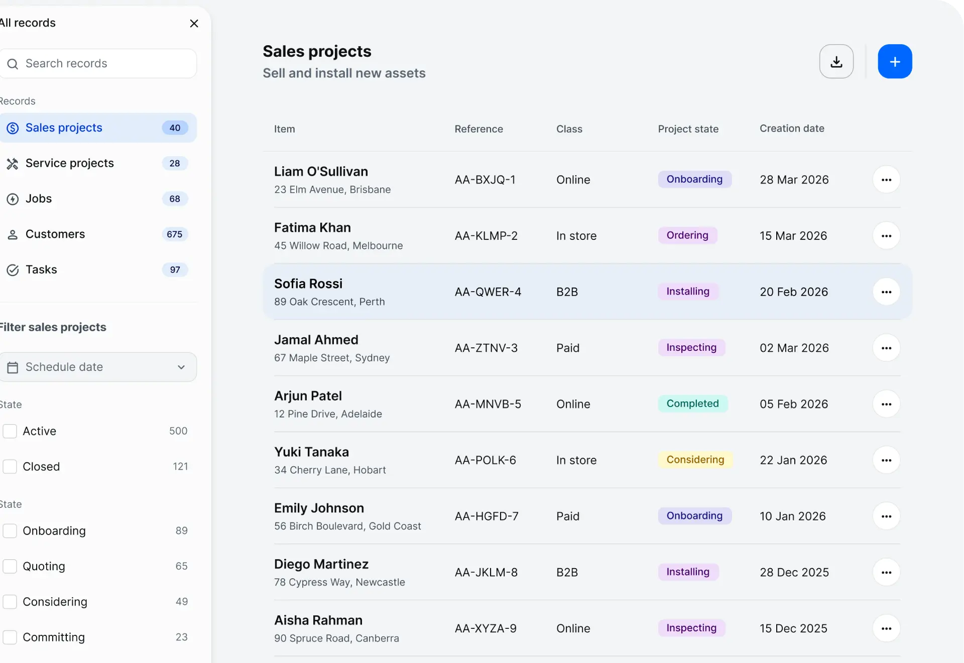
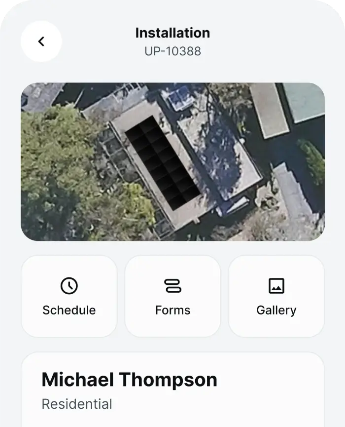
UPowr is an SaaS platform for managing clean energy installations. The platform supports designers who create solar quotes, operators who manage jobs and schedules, and installers working on site. When I joined, the product was transitioning from enterprise to mid-market user base. Working within a small cross-functional team, I led UX and UI design across the platform from discovery through delivery.
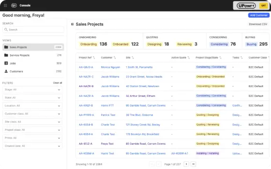
Baseline designed by another designer

So I did see it, I just didn't pick up on seeing it
User testing participant
Usability testing revealed issues with discoverability, navigation and error recovery. Primary actions were difficult to identify due to low contrast buttons. Tables relied on horizontal scrolling, layouts were not responsive, and interaction patterns varied across the platform. Users lacked clear feedback and guidance when completing complex workflows.
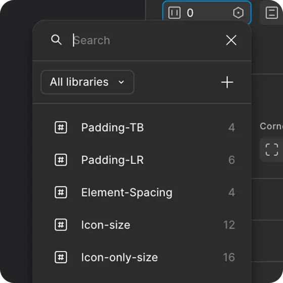
No scale system in place
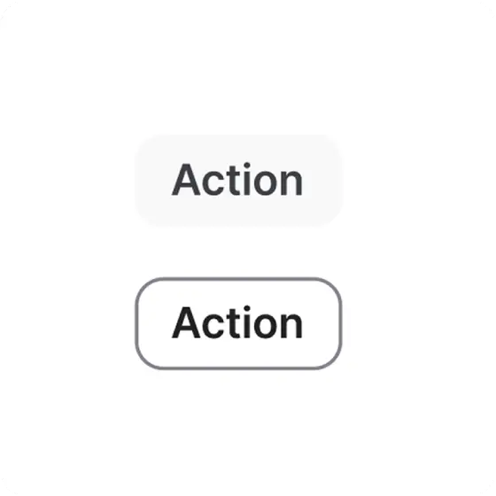
Light grey CTA was difficult to see
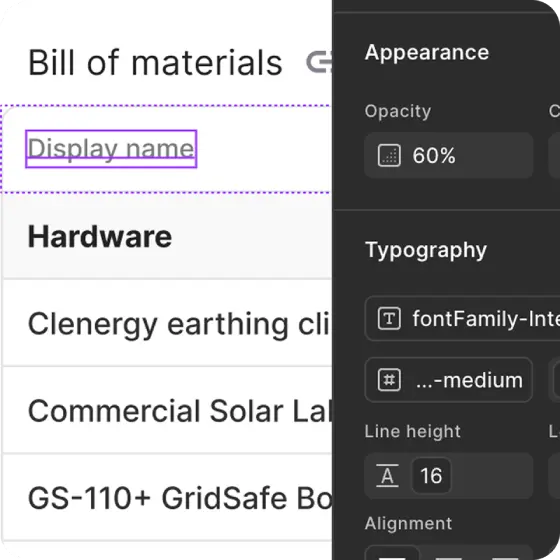
Opacity secondary text colour
I assessed UPowr's existing enterprise design system and made the decision to rebuild it from scratch. The system lacked the structure needed to support future growth. It used inconsistent tokens, varied naming conventions, and an unstable grid system. Starting again allowed me to create a solid foundation that could evolve with the product rather than inherit previous limitations.
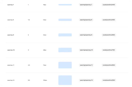
Sizing scale
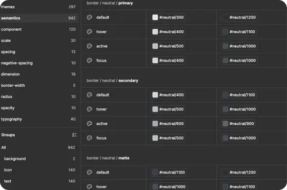
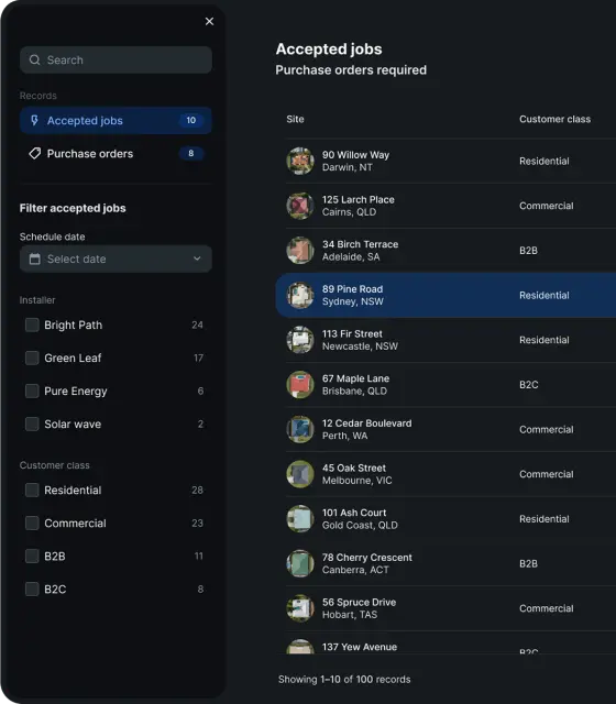
Light and dark mode tokens
I defined the core design foundations, including colour, typography, spacing, elevation, corner radius and iconography. Working closely with developers, I established shared naming conventions and implementation patterns. Ensuring the system became a shared language between design and engineering rather than a disconnected Figma library.
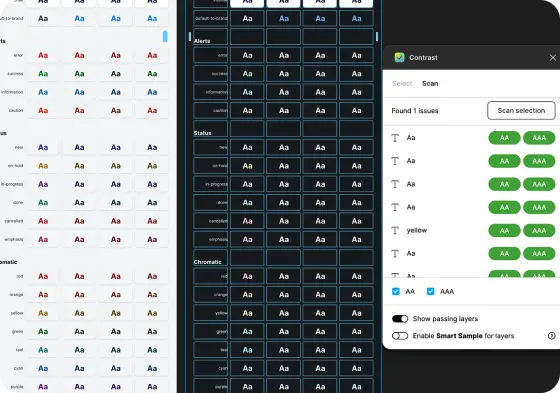
WCAG AA contrast ratio
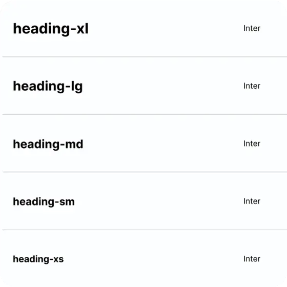
Type scale to establish hierarchy
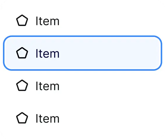
Focus states
Accessibility was built into the system from the beginning. Semantic colour tokens were designed to meet WCAG AA contrast requirements, and actions were never communicated through colour alone.
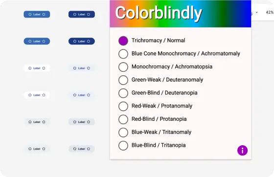
Colourblind-friendly actions
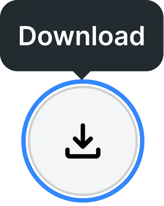
Icon buttons with a tooltip
Typography was designed for readability with clear hierarchy, spacing and line heights, while components included visible focus states and predictable interactions to support keyboard and assistive technology users.
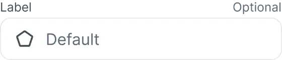
Input field

Primary button

App barcode field
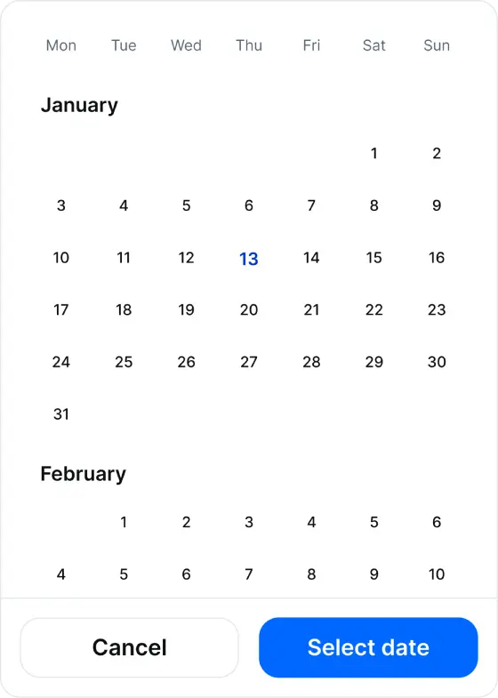
Scrolling date picker
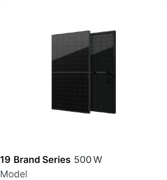
Asset card
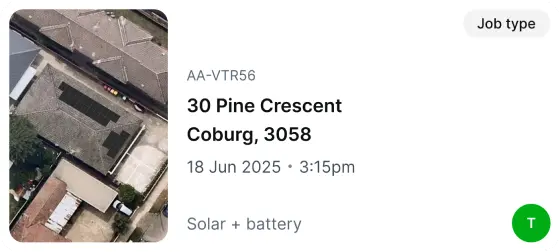
Job card
Components were built from foundational tokens using a systematic approach. Starting with simple elements such as buttons, inputs and selectors, the system expanded into reusable patterns and page-level components.
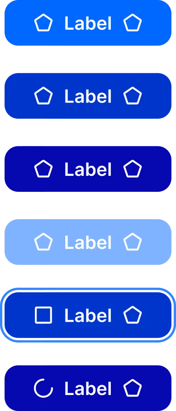
Each component included defined states and variants, including default, hover, active, disabled and focus states, creating predictable behaviour across the platform.
Usability testing informed every component, ensuring the system evolved around user needs rather than visual preference.
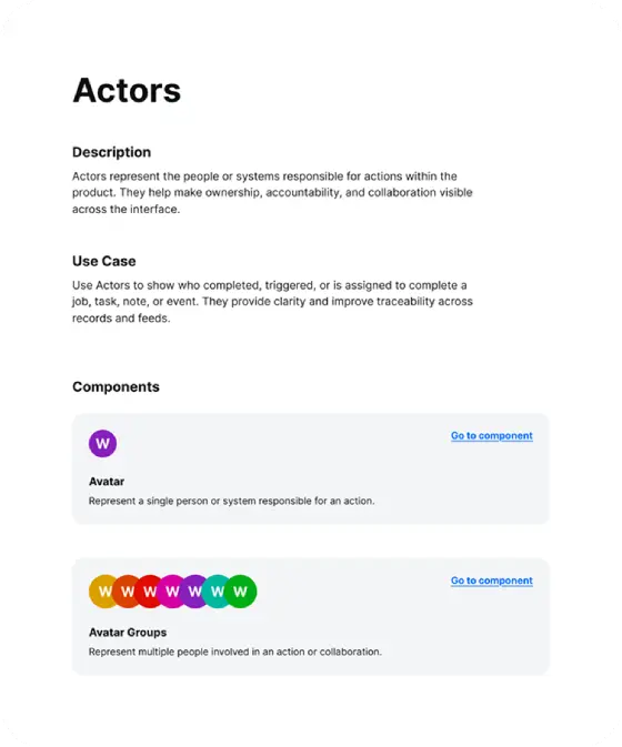
Design system groupings
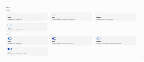
Interactive states
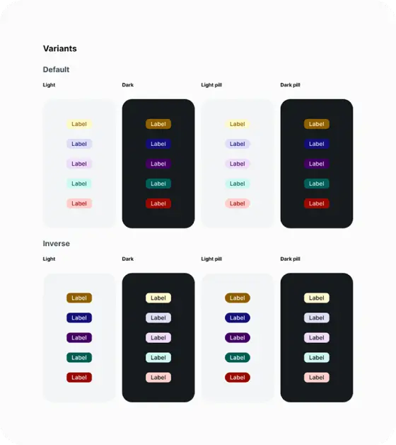
Modes
Every component was documented with guidance covering purpose, usage, interaction behaviour, variants, states, accessibility considerations and implementation notes.
This reduced uncertainty between design and development, improved consistency and made it easier for future team members to understand and use the system.
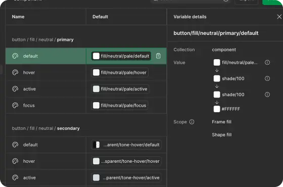
Colour mode mapping
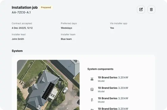
Staged roll out
The design system was integrated with Claude Code using Figma's MCP, giving developers direct access to approved components and implementation guidance within their workflow. This reduced ambiguity during handoff, strengthened consistency between design and code, and improved collaboration.
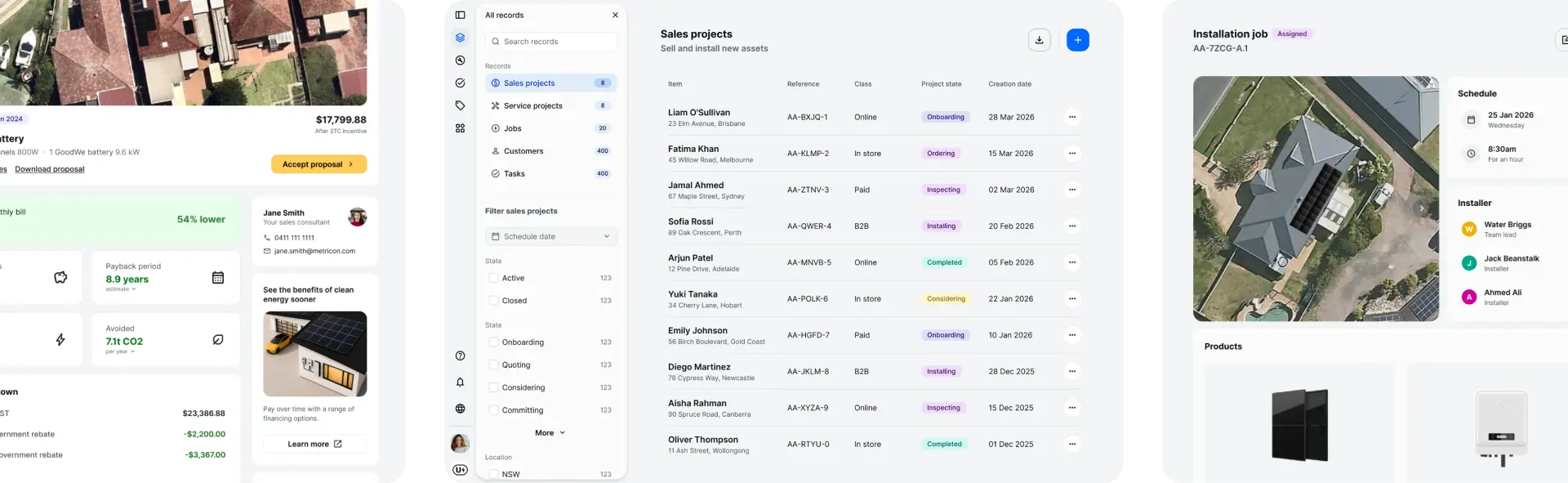
I led a staged rollout, introducing the system through new features and redesigns so the team could improve the experience without slowing delivery.
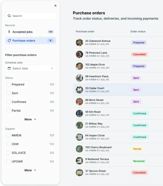
The design system first supported the platform redesign before expanding into a redesigned installer app and an entirely new CX platform. Reusing the same components, tokens and accessibility standards across each product demonstrated that the system could support different audiences while maintaining a consistent experience.
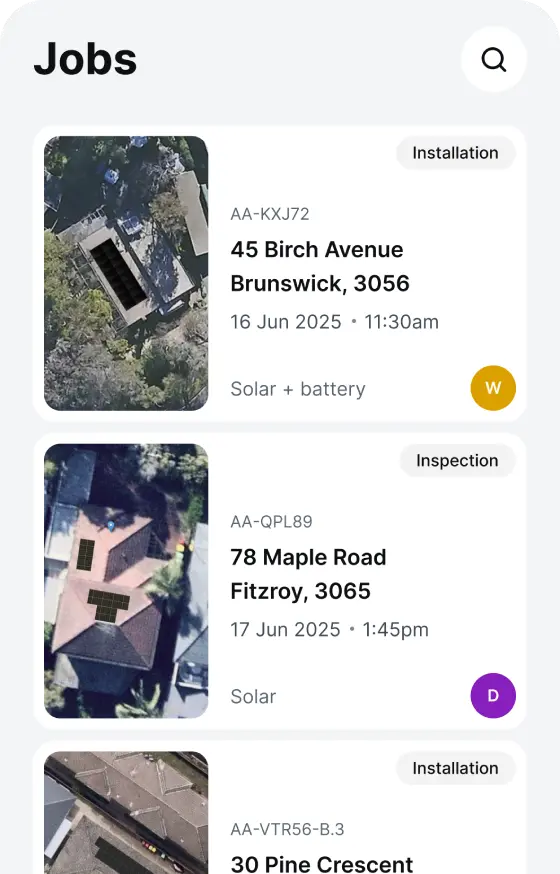
By partnering closely with engineering throughout adoption, the design system became a shared way of working that enabled faster delivery, reduced duplication, and supported future product growth.
AA
WCAG compliant design system
3
products powered by the design system
MCP
enabled faster, more consistent delivery
Having a shared design foundation changed how the team worked. With aligned tokens, components and accessibility standards in place, design and development could collaborate faster and with greater confidence.
The design system became more than a UI library. It created a shared approach for testing ideas, solving user problems and delivering better user experiences.

Create UPowr's design system to support three products with a shared, scalable foundation
AA
WCAG compliant design system
3
products powered by the design system
MCP
enabled faster, more consistent delivery
UPowr is an SaaS platform for managing clean energy installations. The platform supports designers who create solar quotes, operators who manage jobs and schedules, and installers working on site. When I joined, the product was transitioning from enterprise to mid-market user base. Working within a small cross-functional team, I led UX and UI design across the platform from discovery through delivery.
Baseline designed by another designer
So I did see it, I just didn't pick up on seeing it
User testing participant
Usability testing revealed issues with discoverability, navigation and error recovery. Primary actions were difficult to identify due to low contrast buttons. Tables relied on horizontal scrolling, layouts were not responsive, and interaction patterns varied across the platform. Users lacked clear feedback and guidance when completing complex workflows.
No scale system in place
Light grey CTA was difficult to see
Opacity secondary text colour
I assessed UPowr's existing enterprise design system and made the decision to rebuild it from scratch. The system lacked the structure needed to support future growth. It used inconsistent tokens, varied naming conventions, and an unstable grid system. Starting again allowed me to create a solid foundation that could evolve with the product rather than inherit previous limitations.
Sizing scale
Light and dark mode tokens
I defined the core design foundations, including colour, typography, spacing, elevation, corner radius and iconography. Working closely with developers, I established shared naming conventions and implementation patterns. Ensuring the system became a shared language between design and engineering rather than a disconnected Figma library.
WCAG AA contrast ratio
Type scale to establish hierarchy
Focus states
Accessibility was built into the system from the beginning. Semantic colour tokens were designed to meet WCAG AA contrast requirements, and actions were never communicated through colour alone.
Colourblind-friendly actions
Icon buttons with a tooltip
Typography was designed for readability with clear hierarchy, spacing and line heights, while components included visible focus states and predictable interactions to support keyboard and assistive technology users.
Input field
Primary button
App barcode field
Scrolling date picker
Asset card
Job card
Components were built from foundational tokens using a systematic approach. Starting with simple elements such as buttons, inputs and selectors, the system expanded into reusable patterns and page-level components.
Each component included defined states and variants, including default, hover, active, disabled and focus states, creating predictable behaviour across the platform.
Usability testing informed every component, ensuring the system evolved around user needs rather than visual preference.
Design system groupings
Interactive states
Modes
Every component was documented with guidance covering purpose, usage, interaction behaviour, variants, states, accessibility considerations and implementation notes.
This reduced uncertainty between design and development, improved consistency and made it easier for future team members to understand and use the system.
Colour mode mapping
Staged roll out
The design system was integrated with Claude Code using Figma's MCP, giving developers direct access to approved components and implementation guidance within their workflow. This reduced ambiguity during handoff, strengthened consistency between design and code, and improved collaboration.
I led a staged rollout, introducing the system through new features and redesigns so the team could improve the experience without slowing delivery.
The design system first supported the platform redesign before expanding into a redesigned installer app and an entirely new CX platform. Reusing the same components, tokens and accessibility standards across each product demonstrated that the system could support different audiences while maintaining a consistent experience.
By partnering closely with engineering throughout adoption, the design system became a shared way of working that enabled faster delivery, reduced duplication, and supported future product growth.
AA
WCAG compliant design system
3
products powered by the design system
MCP
enabled faster, more consistent delivery
Having a shared design foundation changed how the team worked. With aligned tokens, components and accessibility standards in place, design and development could collaborate faster and with greater confidence.
The design system became more than a UI library. It created a shared approach for testing ideas, solving user problems and delivering better user experiences.

Create UPowr's design system to support three products with a shared, scalable foundation
AA
WCAG compliant design system
3
products powered by the design system
MCP
enabled faster, more consistent delivery
UPowr is an SaaS platform for managing clean energy installations. The platform supports designers who create solar quotes, operators who manage jobs and schedules, and installers working on site. When I joined, the product was transitioning from enterprise to mid-market user base. Working within a small cross-functional team, I led UX and UI design across the platform from discovery through delivery.
Baseline designed by another designer

So I did see it, I just didn't pick up on seeing it
User testing participant
Usability testing revealed issues with discoverability, navigation and error recovery. Primary actions were difficult to identify due to low contrast buttons. Tables relied on horizontal scrolling, layouts were not responsive, and interaction patterns varied across the platform. Users lacked clear feedback and guidance when completing complex workflows.
No scale system in place
Light grey CTA was difficult to see
Opacity secondary text colour
I assessed UPowr's existing enterprise design system and made the decision to rebuild it from scratch. The system lacked the structure needed to support future growth. It used inconsistent tokens, varied naming conventions, and an unstable grid system. Starting again allowed me to create a solid foundation that could evolve with the product rather than inherit previous limitations.
Sizing scale
Light and dark mode tokens
I defined the core design foundations, including colour, typography, spacing, elevation, corner radius and iconography. Working closely with developers, I established shared naming conventions and implementation patterns. Ensuring the system became a shared language between design and engineering rather than a disconnected Figma library.
WCAG AA contrast ratio
Type scale to establish hierarchy
Focus states
Accessibility was built into the system from the beginning. Semantic colour tokens were designed to meet WCAG AA contrast requirements, and actions were never communicated through colour alone.
Colourblind-friendly actions
Icon buttons with a tooltip
Typography was designed for readability with clear hierarchy, spacing and line heights, while components included visible focus states and predictable interactions to support keyboard and assistive technology users.
Input field
Primary button
App barcode field
Scrolling date picker
Asset card
Job card
Components were built from foundational tokens using a systematic approach. Starting with simple elements such as buttons, inputs and selectors, the system expanded into reusable patterns and page-level components.
Each component included defined states and variants, including default, hover, active, disabled and focus states, creating predictable behaviour across the platform.
Usability testing informed every component, ensuring the system evolved around user needs rather than visual preference.
Design system groupings
Interactive states
Modes
Every component was documented with guidance covering purpose, usage, interaction behaviour, variants, states, accessibility considerations and implementation notes.
This reduced uncertainty between design and development, improved consistency and made it easier for future team members to understand and use the system.
Colour mode mapping
Staged roll out
The design system was integrated with Claude Code using Figma's MCP, giving developers direct access to approved components and implementation guidance within their workflow. This reduced ambiguity during handoff, strengthened consistency between design and code, and improved collaboration.
I led a staged rollout, introducing the system through new features and redesigns so the team could improve the experience without slowing delivery.
The design system first supported the platform redesign before expanding into a redesigned installer app and an entirely new CX platform. Reusing the same components, tokens and accessibility standards across each product demonstrated that the system could support different audiences while maintaining a consistent experience.
By partnering closely with engineering throughout adoption, the design system became a shared way of working that enabled faster delivery, reduced duplication, and supported future product growth.
AA
WCAG compliant design system
3
products powered by the design system
MCP
enabled faster, more consistent delivery
Having a shared design foundation changed how the team worked. With aligned tokens, components and accessibility standards in place, design and development could collaborate faster and with greater confidence.
The design system became more than a UI library. It created a shared approach for testing ideas, solving user problems and delivering better user experiences.